The club meetings always have a broad mix of periods and scales, but also a huge variation in styles. The design approaches are indeed eclectic.
It got me thinking.
Many people have a design style that they use for all their wargaming projects.
Yet, I tend to decide on a 'look', a presentation style, that's particular to each specific project.
No more is this evident than in the look of the terrain, and in particular the colour of rivers.
By way of example, here are a few of my projects to illustrate what I mean.


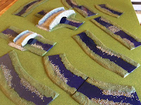
Now, don't let's get too bogged down in the true 'realistic' colour of water, or how rivers 'should' be presented...
(I suppose being 'bogged down' should in fact be reserved for marshes anyway).


When starting a new project, do you decide on a deliberate 'design style'?
Or do you just do it in your 'usual way.'?
Food for thought...
Looking forward to the VWC on Saturday again Phil.
ReplyDeleteWhen starting a new project I just fall into it, when designing scenery or terrain I go with the flow as the idea takes me. I tend to have an idea, I look on line to find inspiration.
Promising myself to write notes and plan the project but normally I just do it in my head and jump strait into it.
Stay safe and happy gaming,
Willz Harley.
I find that the realistic shade of water is somewhere between the shade of the river bed, if clear and shallow, and the shade of the sky, if reasonably calm, tempered by the shade of the soil that has been carried downriver by it, so that Alpine rivers can be anything from foaming white, to chalky grey, to emerald green or even black in winter.
ReplyDeleteMostly though, I go with the dull shade of coppery blue that I last painted my lounge doors with :-)
Regards, Chris.
I love the river colour in your middle photo Phil. Easy on the eye, not obtrusive, neither realistic, but dull, like mine nor garish, just tasteful. Glad you are still enjoying the VWC. cheers
ReplyDeleteChris G
I suppose, and much like the painting of my figures, I aim to please myself above all. A nice, neat, stylized look is fine by me regardless of era or project.
ReplyDeleteBest Regards,
Stokes
I'm with you. I keep a visual theme to my different projects, although most of my terrain building has been focused on a 15mm Renaissance skirmish project, which has been autumnal themed.
ReplyDeleteFrostgrave is wintery, and my smattering of 6mm is generic green summer.
I carry on in the same old style :) with variations
ReplyDeleteThe nearest I used to get to specific design was the bases of ancient armies, Celts with logs, Ptolemaic with Sandy desert etc.
ReplyDeleteHowever, many years ago I embarked on an Imagi-Nations project, long before they were called that (and popular with OSW) with a very specific design brief. More detail on my blog, but it has evolved into a part homage to the Wargame and Charge but with its own peculiarities; only plastic, Britain's and Merit trees with Schreiber and other Eastern European paper buildings.
I cannot envision anything other than a plain felt cloth.
I think the visual style of a game is one of the core essentials of our hobby, but it gets often overlooked by discussions about rules, miniatures etc.
ReplyDeleteI also feel that there seems to be convergence to what I would call the "model railroad style", and other styles tend to be overlooked.
Luckily, there seems to be a resurrection of the "toy soldier" style: shiny toy soldier-like figures, using scenery that has a toy-like feel as well.
Making wargames in a visual style more akin to let's say paintings depicting battles of the period is still an unexplored area.
Pressure on storage space and and an interest in a wide range of periods determines that my terrain needs to be as multi-functional as possible.
ReplyDeleteMy river colour should be much more subdued ...... but I like it and it photographs in a way that the view knows what it is, unlike my hills, which photography can tend to ‘blow out’ so that they look too flat, or worse, non-existent.
That's a really interesting mix of shades of green and tabletops from 'ordered', toy-soldier-style to more 'realistic'. I assume the shades of green are real and not an artefact of camera settings?
ReplyDeleteI'd be with Norm in that I could perhaps stretch to 'snow', 'green', 'mud' and perhaps 'sand' terrain, but tend to re-use terrain pieces within and even between these. I really like the effect and added qualities that your extra effort produces though.
Regards, James